
Improving App navigation

Focus on the core
From 1 Hamburger with 7 items to 1 tab menu with 4 items
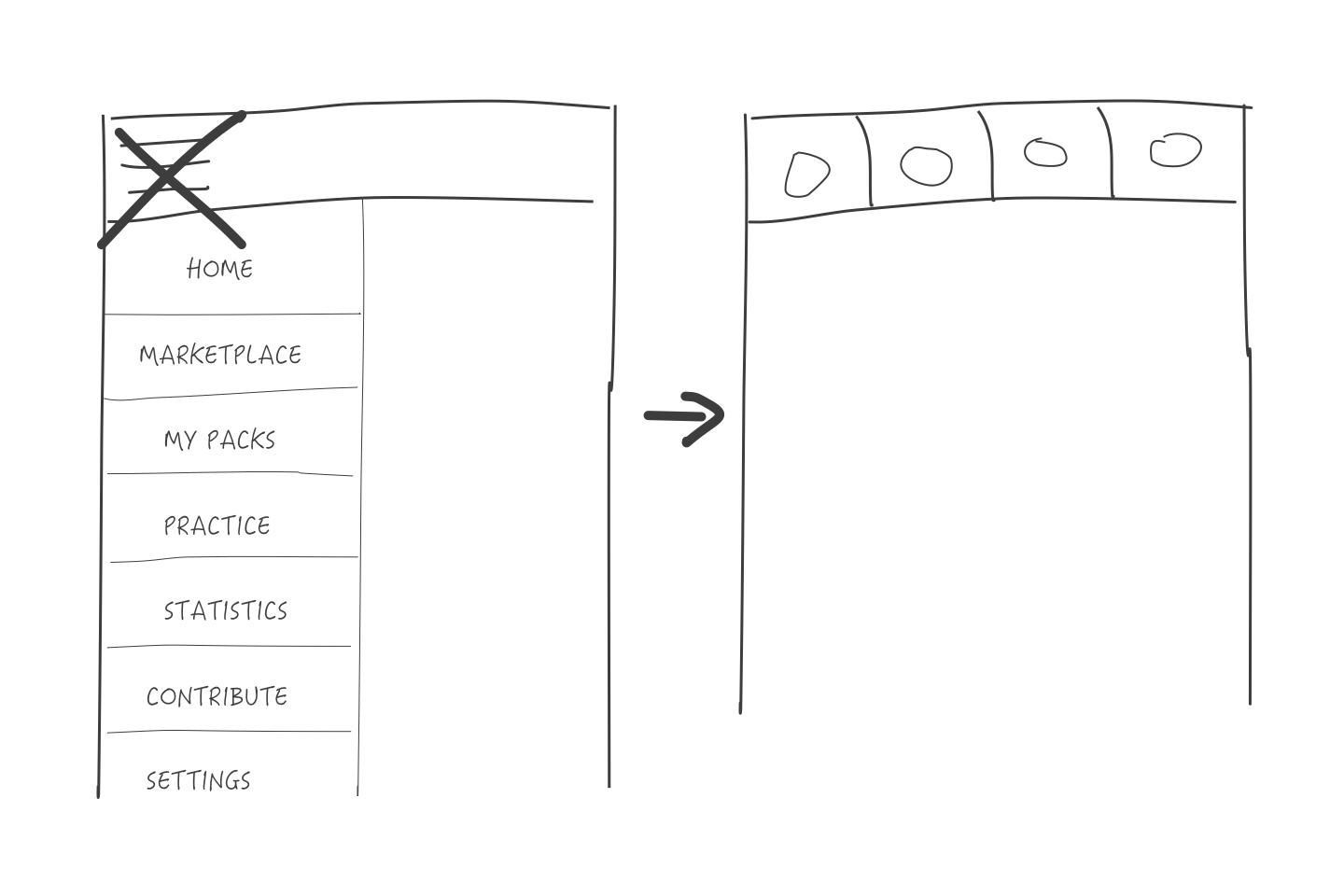
distributing menu items
Call-To-Action
Which is the most used action for users? (based on the Material Design rules)
Learning their content 'Practice'
This action will become the Floating Action Button, always visible and accessible for the user.
Learning their content 'Practice'
This action will become the Floating Action Button, always visible and accessible for the user.
What does the user want to see first?
Their learning content 'My packs'.
This will be the first Tab
Their learning content 'My packs'.
This will be the first Tab
Which is the 2nd most used action for users?
Adding content to learn 'Get Packs'
Adding content to learn 'Get Packs'
3rd Tab: User feedback
users had difficulty understanding the 'statistics' in the app and would like to know about their progress.
We updated the content with more relatable info regarding the 'Progress' of the user.
users had difficulty understanding the 'statistics' in the app and would like to know about their progress.
We updated the content with more relatable info regarding the 'Progress' of the user.
Contribute
A feature where you could sponsor the app, which was outdated and not usefull anymore at that point.
A feature where you could sponsor the app, which was outdated and not usefull anymore at that point.
Settings
The most popular features (based on user data). Where placed under 'Add-Ons'.
A way to give our power-users the ability to install extra features and for the non-power users to keep the app simple.
The most popular features (based on user data). Where placed under 'Add-Ons'.
A way to give our power-users the ability to install extra features and for the non-power users to keep the app simple.

Recognizable icons
Finding an icon that indicates what content will be visible after clicking the icon.
Learnings: It was a mistake to not test all the icons with the user because we were limited in time. The changes afterwards costet us another release, which is even more time consuming.
This was one of the few design decisions that were heavily influenced by the stakeholders, instead of the user.
When the new design was released, we received a lot of feedback that the icons where not so relatable except for the one 'progress' which we tested with users.

Guerilla user testing
We printed out a piece of paper and went outside to ask several passer-by:
"Which icon relates best to the term 'your progres'?"
"Which icon relates best to the term 'your progres'?"

FINAL RESULT | UI
